
三、核心组件详解
3.1 按钮组件 AtButton
按钮是用户交互中最基础的组件,Taro UI提供了AtButton组件,支持多种类型和状态。
基本用法
import { AtButton } from 'taro-ui'

// 主要按钮
<AtButton type='primary'>主要按钮</AtButton>

// 次要按钮
<AtButton type='secondary'>次要按钮</AdaButton>

// 警告按钮
<AtButton type='warn'>警告按钮</AtButton>

// 禁用状态
<AtButton disabled>禁用按钮</AtButton>

// 加载状态
<AtButton loading>加载中</AtButton>
按钮尺寸
<AtButton size='normal'>正常尺寸</AtButton>
<AtButton size='small'>小尺寸</AtButton>
完整示例:带事件处理的按钮
import { AtButton } from 'taro-ui'
import { useState } from 'react'

export default function ButtonDemo() {
  const [loading, setLoading] = useState(false)

  const handleClick = async () => {
    setLoading(true)
    // 模拟异步操作
    await new Promise(resolve => setTimeout(resolve, 2000))
    setLoading(false)
  }

  return (
    <AtButton
      type='primary'
      loading={loading}
      onClick={handleClick}
    >
      点击加载
    </AtButton>
  )
}
3.2 加载更多组件 AtLoadMore
AtLoadMore组件是实现无限滚动和分页加载的核心组件,常用于列表底部展示加载状态。
三种状态说明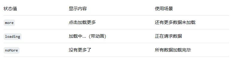
基本用法
import { AtLoadMore } from 'taro-ui'

export default class ListPage extends Component {
  state = {
    status: 'more',  // more / loading / noMore
    page: 1,
    list: []
  }

  handleLoadMore = () => {
    this.setState({ status: 'loading' })

    // 请求下一页数据
    fetchData(this.state.page + 1).then(newData => {
      if (newData.length === 0) {
        this.setState({ status: 'noMore' })
      } else {
        this.setState({
          list: [...this.state.list, ...newData],
          page: this.state.page + 1,
          status: 'more'
        })
      }
    })
  }

  render() {
    return (
      <View>
        {/* 列表内容 */}
        {this.state.list.map(item => (
          <View key={item.id}>{item.name}</View>
        ))}

        {/* 加载更多组件 */}
        <AtLoadMore
          status={this.state.status}
          onClick={this.handleLoadMore}
        />
      </View>
    )
  }
}
自定义文案
<AtLoadMore
  status='more'
  moreText='点击加载更多'
  loadingText='正在加载中...'
  noMoreText='已经到底了'
/>
3.3 表单组件
Taro UI提供了完整的表单组件体系,包括输入框、单选框、多选框、开关等。
输入框 AtInput
import { AtInput } from 'taro-ui'

<AtInput
  name='username'
  title='用户名'
  type='text'
  placeholder='请输入用户名'
  value={username}
  onChange={value => this.setState({ username: value })}
/>

<AtInput
  name='password'
  title='密码'
  type='password'
  placeholder='请输入密码'
  value={password}
  onChange={value => this.setState({ password: value })}
/>
开关 AtSwitch
import { AtSwitch } from 'taro-ui'

<AtSwitch
  title='接收通知'
  checked={checked}
  onChange={value => this.setState({ checked: value })}
/>
复选框 AtCheckbox
import { AtCheckbox } from 'taro-ui'

const options = [
  { value: 'apple', label: '苹果' },
  { value: 'banana', label: '香蕉' },
  { value: 'orange', label: '橙子' }
]

<AtCheckbox
  options={options}
  selectedList={selectedList}
  onChange={selectedList => this.setState({ selectedList })}
/>
完整表单示例
import { AtForm, AtInput, AtSwitch, AtButton } from 'taro-ui'

export default function RegisterForm() {
  const [formData, setFormData] = useState({
    username: '',
    phone: '',
    agree: false
  })

  const handleSubmit = () => {
    // 表单验证和提交逻辑
    console.log('提交数据:', formData)
  }

  return (
    <AtForm>
      <AtInput
        name='username'
        title='用户名'
        type='text'
        placeholder='请输入用户名'
        value={formData.username}
        onChange={value => setFormData({...formData, username: value})}
      />
      <AtInput
        name='phone'
        title='手机号'
        type='number'
        placeholder='请输入手机号'
        value={formData.phone}
        onChange={value => setFormData({...formData, phone: value})}
      />
      <AtSwitch
        title='同意用户协议'
        checked={formData.agree}
        onChange={value => setFormData({...formData, agree: value})}
      />
      <AtButton type='primary' onClick={handleSubmit}>注册</AtButton>
    </AtForm>
  )
}
3.4 消息提示组件 AtMessage
AtMessage用于在页面顶部显示全局提示信息,适用于操作反馈场景。
配置方式
在页面组件中配置AtMessage组件:
import { AtMessage } from 'taro-ui'

export default function MyPage() {
  return (
    <View>
      <AtMessage />
      {/* 页面其他内容 */}
    </View>
  )
}
使用方式
import Taro from '@tarojs/taro'

// 成功提示
Taro.atMessage({
  message: '操作成功',
  type: 'success'
})

// 错误提示
Taro.atMessage({
  message: '操作失败',
  type: 'error'
})

// 警告提示
Taro.atMessage({
  message: '请注意',
  type: 'warning'
})
四、主题定制与样式
4.1 SCSS变量定制
Taro UI基于SCSS编写,支持通过覆盖变量来定制主题。
创建自定义主题文件
// custom-theme.scss
// 覆盖默认主题变量

// 主色调
$color-brand: #16baaa !default;  // 默认是绿色,可以改成品牌色
$color-brand-light: #4bc7bc !default;
$color-brand-dark: #11a195 !default;

// 辅助色
$color-success: #07c160 !default;
$color-error: #ee0a24 !default;
$color-warning: #ff976a !default;

// 字体大小
$font-size-sm: 24px !default;
$font-size-base: 28px !default;
$font-size-lg: 32px !default;

// 导入Taro UI样式
@import 'taro-ui/dist/style/index.scss';
在项目中引入自定义主题
// app.js
import './custom-theme.scss'
4.2 自定义组件样式
除了全局主题定制,还可以通过className或style属性覆盖单个组件的样式。
<AtButton
  className='custom-button'
  type='primary'
>
  自定义按钮
</AtButton>
// 对应的样式文件
.custom-button {
  background: linear-gradient(135deg, #667eea 0%, #764ba2 100%);
  border: none;
  border-radius: 48px;
}
4.3 多端样式适配
Taro支持使用条件编译语法来处理不同平台的样式差异。
// 根据平台显示不同样式
<View className={process.env.TARO_ENV === 'weapp' ? 'weapp-style' : 'h5-style'}>
  内容
</View>
/* 微信小程序特有样式 */
.weapp-style {
  font-size: 32px;  // 小程序使用rpx转换
}

/* H5特有样式 */
.h5-style {
  font-size: 16px;  // H5使用px
}
五、多端适配最佳实践
5.1 跨平台开发注意事项
Taro UI虽然支持多端运行,但在实际开发中仍需注意平台差异。
尺寸单位适配
Taro默认使用px作为尺寸单位,编译时会自动转换为各平台适配的单位:
小程序:转换为rpx
H5:保持px
RN:转换为pt
// 开发时直接使用px
.button {
  width: 200px;
  height: 80px;
  font-size: 28px;
}
平台特有功能处理
// 判断当前运行环境
if (process.env.TARO_ENV === 'weapp') {
  // 微信小程序特有逻辑
  wx.showShareMenu()
} else if (process.env.TARO_ENV === 'h5') {
  // H5特有逻辑
  window.location.href = '/share'
}
5.2 小程序生命周期适配
在使用Taro UI开发小程序时,需要注意组件生命周期与页面生命周期的差异。
页面生命周期(pages目录下)
import { Component } from 'react'

export default class MyPage extends Component {
  // 页面加载
  componentDidMount() { }

  // 页面卸载
  componentWillUnmount() { }

  // 页面显示(小程序特有)
  componentDidShow() { }

  // 页面隐藏(小程序特有)
  componentDidHide() { }

  // 下拉刷新
  onPullDownRefresh() { }

  // 上拉加载更多
  onReachBottom() { }

  render() {
    return <View>页面内容</View>
  }
}
组件生命周期(components目录下)
注意:onReachBottom等页面级生命周期在子组件中无效,必须在页面组件中处理。
5.3 最佳实践建议
按需引入组件:避免全局引入导致包体积过大
主题定制:通过SCSS变量统一管理品牌色
合理使用LoadMore:列表场景使用AtLoadMore实现分页加载
注意平台差异:小程序特有的API需要条件判断
保持版本同步:Taro和Taro UI版本需要匹配
来源:
https://bncne.cn/


