1.CSS导航栏
导航栏
熟练使用导航栏,对于任何网站都非常重要。
使用CSS你可以转换成好看的导航栏而不是枯燥的HTML菜单。


2.导航栏==链接列表
作为标准的HTML基础一个导航栏是必须的,在我们的例子中我们将建立一个标准的HTML列表导航栏。
导航条基本上是一个链接列表,所以使用 <ul> 和 <li>元素非常有意义:
· list-style-type:none - 移除列表前小标志。一个导航栏并不需要列表标记
· 移除浏览器的默认设置将边距(margin)和填充(padding)设置为0
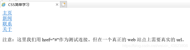
<!DOCTYPE html>
<html lang="en">
  <head>
    <meta charset="utf-8" />
    <title>CSS简单学习</title>
    <style type="text/css">
      ul {
        list-style-type: none;
        margin: 0;
        padding: 0;
      }
    </style>
  </head>
  <body>
    <ul>
      <li><a href="#home">主页</a></li>
      <li><a href="#news">新闻</a></li>
      <li><a href="#contact">联系</a></li>
      <li><a href="#about">关于</a></li>
    </ul>
    <p>注意:这里我们用 href="#"作为测试连接。但在一个真正的 web 站点上需要真实的 url。</p>
  </body>
</html>
3.垂直导航栏
display:block - 显示块元素的链接,让整体变为可点击链接区域(不只是文本),它允许我们指定宽度。
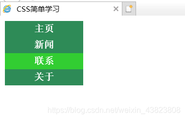
创建一个简单的垂直导航条实例,在鼠标移动到选项时,修改背景颜色:
<!DOCTYPE html>
<html lang="en">
  <head>
    <meta charset="utf-8">
    <title>CSS简单学习</title>
    <style type="text/css">
      ul {
        list-style-type: none;
        margin: 0;
        padding: 0;
      }
      a:link,a:visited {
        display: block;
        padding: 4px;
        width: 120px;
        font-weight: bold;
        text-align: center;
        text-decoration: none;
        text-transform: uppercase;
        color: white;
        background-color: seagreen;
      }
      a:hover,a:active {
        background-color: limegreen;
      }
    </style>
  </head>
  <body>
    <ul>
      <li><a href="#home">主页</a></li>
      <li><a href="#news">新闻</a></li>
      <li><a href="#contact">联系</a></li>
      <li><a href="#about">关于</a></li>
    </ul>
  </body>
</html>
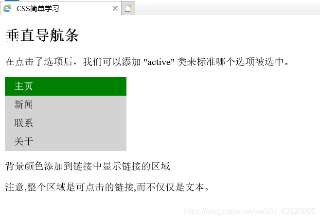
4.激活当前导航条
在点击了选项后,我们可以添加"active" 类来标准哪个选项被选中。
<!DOCTYPE html>
<html lang="en">
  <head>
    <meta charset="utf-8">
    <title>CSS简单学习</title>
    <style type="text/css">
      ul {
        list-style-type: none;
        margin: 0;
        padding: 0;
        width: 200px;
        background-color: lightgrey;
      }
      li a {
        display: block;
        color: #000000;
        padding: 6px 15px;
        text-decoration: none;
      }
      li a.active {
        background-color: green;
        color: white;
      }
      li a:hover:not(.active) {
        background-color: dimgray;
        color: white;
      }
    </style>
  </head>
  <body>
    <h2>垂直导航条</h2>
    <p>在点击了选项后,我们可以添加 "active" 类来标准哪个选项被选中。</p>
    <ul>
      <li><a class="active" href="#home">主页</a></li>
      <li><a href="#news">新闻</a></li>
      <li><a href="#contact">联系</a></li>
      <li><a href="#about">关于</a></li>
    </ul>
    <p>背景颜色添加到链接中显示链接的区域</p>
    <p>注意,整个区域是可点击的链接,而不仅仅是文本。</p>
  </body>
</html>
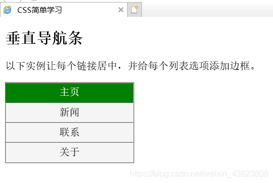
5.创建链接并添加边框
可以在 <li> or <a> 上添加text-align:center样式来让链接居中。
可以在border <ul>上添加border属性来让导航栏有边框。如果要在每个选项上添加边框,可以在每个 <li> 元素上添加border-bottom。
<!DOCTYPE html>
<html lang="en">
  <head>
    <meta charset="utf-8">
    <title>CSS简单学习</title>
    <style type="text/css">
      ul {
        list-style-type: none;
        margin: 0;
        padding: 0;
        width: 200px;
        background-color: whitesmoke;
        border: 1px solid dimgrey;
      }
      li a {
        display: block;
        color: #000000;
        padding: 6px 15px;
        text-decoration: none;
      }
      li {
        text-align: center;
        border-bottom: 1px solid dimgrey;
      }
      li:last-child {
        border-bottom: none;
      }
      li a.active {
        background-color: #008000;
        color: white;
      }
      li a:hover:not(.active) {
        background-color: dimgrey;
        color: white;
      }
    </style>
  </head>
  <body>
    <h2>垂直导航条</h2>
    <p>以下实例让每个链接居中,并给每个列表选项添加边框。</p>
    <ul>
      <li><a class="active" href="#home">主页</a></li>
      <li><a href="#news">新闻</a></li>
      <li><a href="#contact">联系</a></li>
      <li><a href="#about">关于</a></li>
    </ul>
  </body>
</html>
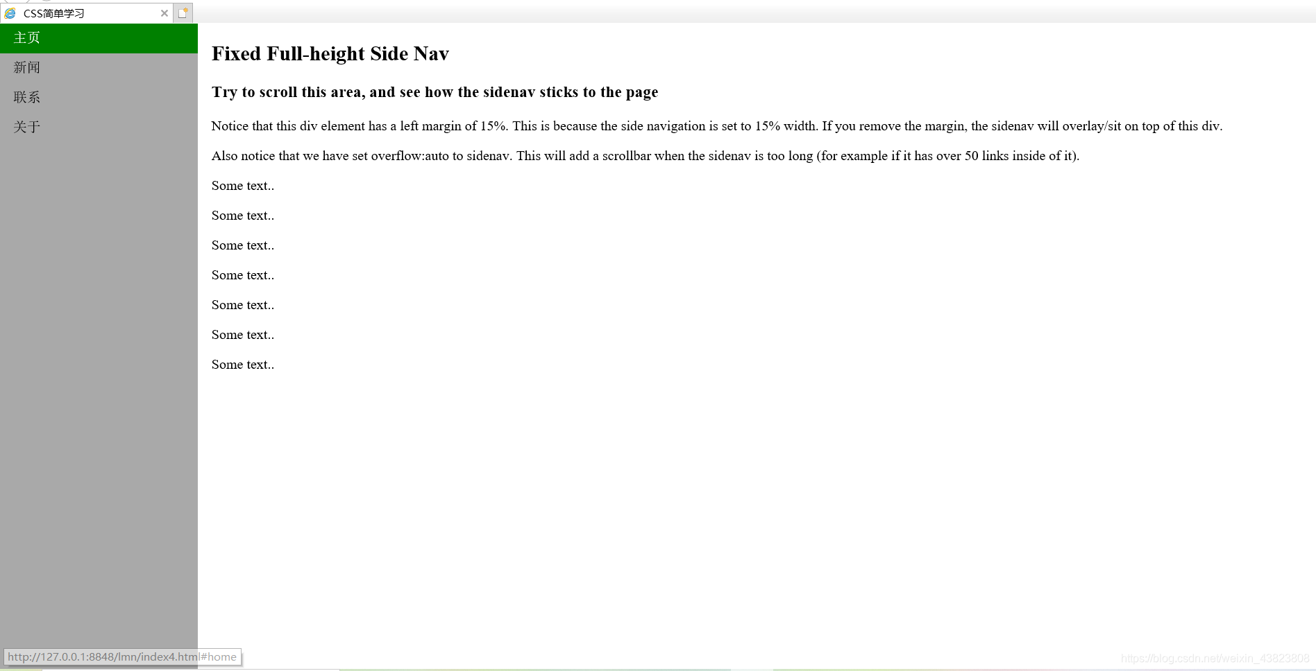
6.全屏高度的固定导航条
创建一个左边是全屏高度的固定导航条,右边是可滚动的内容。
<!DOCTYPE html>
<html lang="en">
  <head>
    <meta charset="utf-8">
    <title>CSS简单学习</title>
    <style type="text/css">
      body {
        margin: 0;
      }
      ul {
        list-style-type: none;
        margin: 0;
        padding: 0;
        width: 15%;
        height: 100%;
        overflow: auto;
        position: fixed;
        background-color: darkgray;
      }
      li a {
        display: block;
        text-decoration: none;
        padding: 8px 15px;
        color: #000000;
      }
      li a.active {
        background-color: #008000;
        color: white;
      }
      li a:hover:not(.active) {
        background-color: dimgrey;
        color: white;
      }
    </style>
  </head>
  <body>
    <ul>
      <li><a class="active" href="#home">主页</a></li>
      <li><a href="#news">新闻</a></li>
      <li><a href="#contact">联系</a></li>
      <li><a href="#about">关于</a></li>
    </ul>
    <div style="margin-left:15%; padding:1px 16px; height:1000px;">
      <h2>Fixed Full-height Side Nav</h2>
      <h3>Try to scroll this area, and see how the sidenav sticks to the page</h3>
      <p>Notice that this div element has a left margin of 15%. This is because the side navigation is set to 15% width. If you remove the margin, the sidenav will overlay/sit on top of this div.</p>
      <p>Also notice that we have set overflow:auto to sidenav. This will add a scrollbar when the sidenav is too long (for example if it has over 50 links inside of it).</p>
      <p>Some text..</p>
      <p>Some text..</p>
      <p>Some text..</p>
      <p>Some text..</p>
      <p>Some text..</p>
      <p>Some text..</p>
      <p>Some text..</p>
    </div>
  </body>
</html>
7.水平导航栏
有两种方法创建横向导航栏。使用内联(inline)或浮动(float)的列表项。
这两种方法都很好,但如果你想链接到具有相同的大小,你必须使用浮动的方法。
<!DOCTYPE html>
<html lang="en">
  <head>
    <meta charset="utf-8">
    <title>CSS简单学习</title>
    <style type="text/css">
      ul {
        list-style-type: none;
        margin: 0;
        padding: 0;
        overflow: hidden;
        background-color: dodgerblue;
      }
      li {
        float: left;
      }
      li a {
        display: block;
        text-decoration: none;
        text-align: center;
        padding: 15px 16px;
        color: white;
      }
      /*li a:hover {
        background-color: skyblue;
      }*/
      li a:hover:not(.active) {
        background-color: skyblue;
        color: white;
      }
      .active {
        background-color: #008000;
        color: white;
      }
    </style>
  </head>
  <body>
    <ul>
      <li><a class="active" href="#home">主页</a></li>
      <li><a href="#news">新闻</a></li>
      <li><a href="#contact">联系</a></li>
      <li><a href="#about">关于</a></li>
      <!--
        <li><a href="#home">主页</a></li>
        <li><a href="#news">新闻</a></li>
        <li><a href="#contact">联系</a></li>
        <li style="float: right;"><a class="active" href="#about">关于</a></li>
      -->
    </ul>
  </body>
</html>

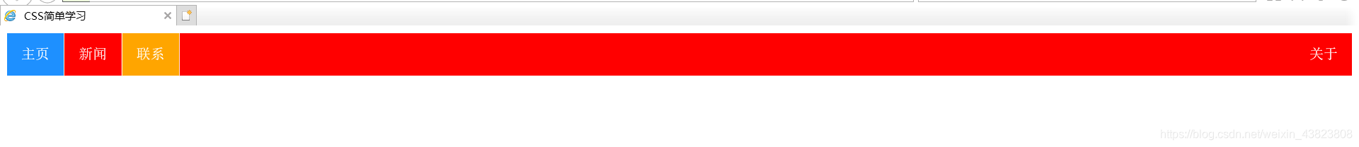
将4个列表项换成代码中注释部分的时候,将会出现如下结果:👇👇👇

8.在导航条之间添加分割线
<li>通过border-right样式来添加分割线。
<!DOCTYPE html>
<html lang="en">
  <head>
    <meta charset="utf-8">
    <title>CSS简单学习</title>
    <style type="text/css">
      ul {
        list-style-type: none;
        margin: 0;
        padding: 0;
        overflow: hidden;
        background-color: red;
      }
      li {
        float: left;
        border-right: 1px solid papayawhip;
      }
      li:last-child {
        border-right: none;
      }
      li a {
        display: block;
        text-align: center;
        text-decoration: none;
        padding: 15px 16px;
        color: white;
      }
      li a:hover:not(.active) {
        background-color: orange;
        color: white;
      }
      .active {
        background-color: #1E90FF;
      }
    </style>
  </head>
  <body>
    <ul>
      <li><a class="active" href="#home">主页</a></li>
      <li><a href="#news">新闻</a></li>
      <li><a href="#contact">联系</a></li>
      <li style="float:right"><a href="#about">关于</a></li>
    </ul>
  </body>
</html>
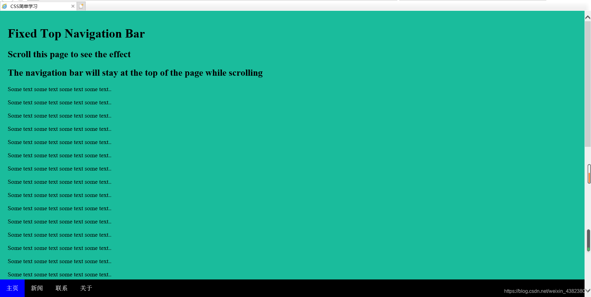
9.将导航栏固定在顶部(top:0;)或底部(bottom:0;)
<!DOCTYPE html>
<html lang="en">
  <head>
    <meta charset="utf-8">
    <title>CSS简单学习</title>
    <style type="text/css">
      body {
        margin: 0;
      }
      ul {
        list-style-type: none;
        margin: 0;
        padding: 0;
        width: 100%;
        position: fixed;
        overflow: hidden;
        background-color: black;
        top: 0;
        /*bottom: 0;*/
      }
      li {
        float: left;
      }
      li a {
        display: block;
        text-align: center;
        text-decoration: none;
        padding: 14px 16px;
        color: white;
      }
      li a:hover:not(.active) {
        background-color: red;
        color: white;
      }
      .active {
        background-color: blue;
        color: white;
      }
    </style>
  </head>
  <body>
    <ul>
      <li><a class="active" href="#home">主页</a></li>
      <li><a href="#news">新闻</a></li>
      <li><a href="#contact">联系</a></li>
      <li><a href="#about">关于</a></li>
    </ul>
    <div style="padding:20px; margin-top:30px; background-color:#1abc9c; height:1500px;">
    <!-- 当使用代码第19行的注释时,可将上方div内联样式中的第二个换成margin-bottom:30px;
       此时运行结果网页的导航栏将位于底部 -->
      <h1>Fixed Top Navigation Bar</h1>
      <h2>Scroll this page to see the effect</h2>
      <h2>The navigation bar will stay at the top of the page while scrolling</h2>
      <p>Some text some text some text some text..</p>
      <p>Some text some text some text some text..</p>
      <p>Some text some text some text some text..</p>
      <p>Some text some text some text some text..</p>
      <p>Some text some text some text some text..</p>
      <p>Some text some text some text some text..</p>
      <p>Some text some text some text some text..</p>
      <p>Some text some text some text some text..</p>
      <p>Some text some text some text some text..</p>
      <p>Some text some text some text some text..</p>
      <p>Some text some text some text some text..</p>
      <p>Some text some text some text some text..</p>
      <p>Some text some text some text some text..</p>
      <p>Some text some text some text some text..</p>
      <p>Some text some text some text some text..</p>
      <p>Some text some text some text some text..</p>
      <p>Some text some text some text some text..</p>
      <p>Some text some text some text some text..</p>
      <p>Some text some text some text some text..</p>
      <p>Some text some text some text some text..</p>
    </div>
  </body>
</html>
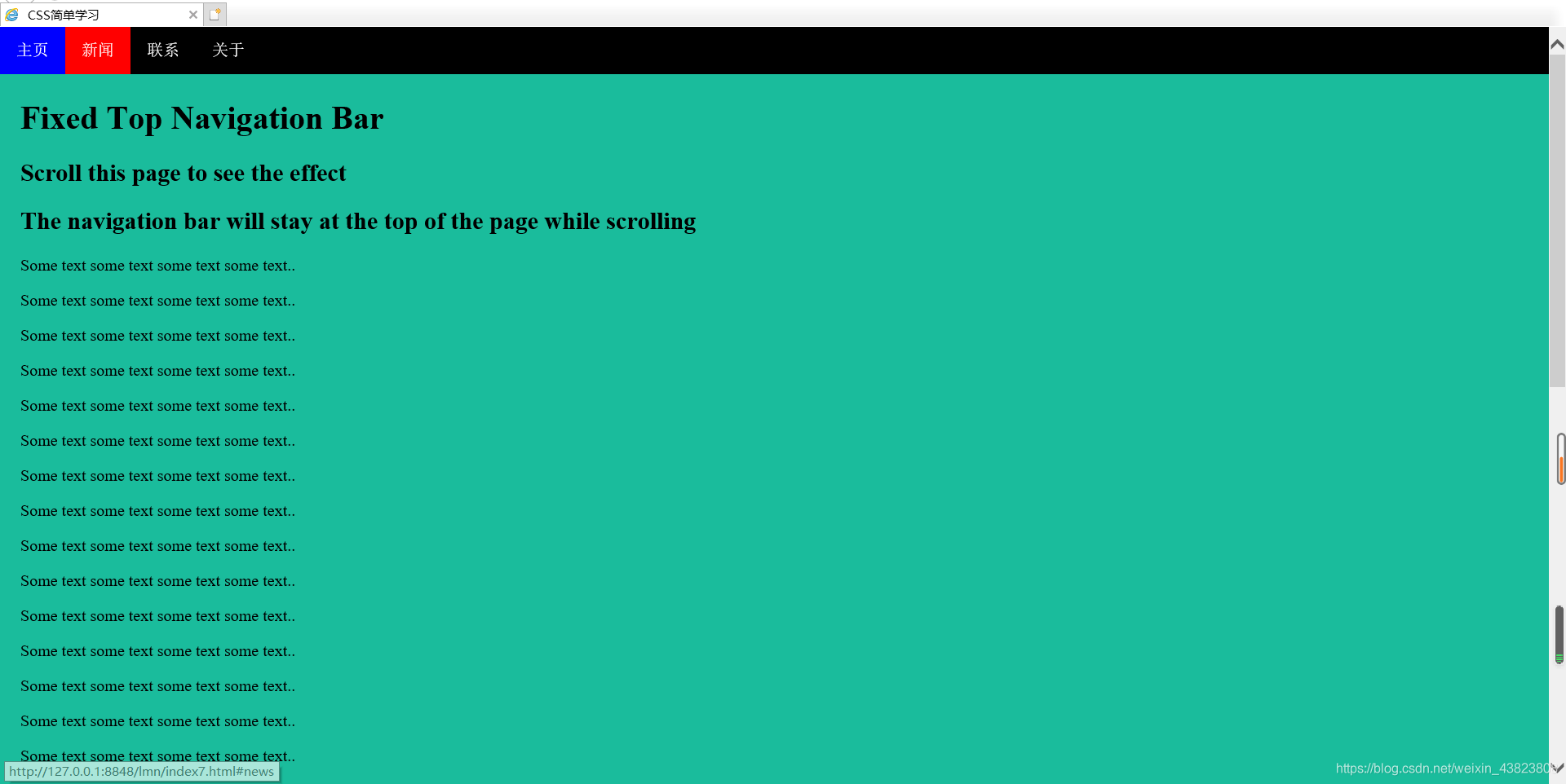
将代码中的第18行用第19行的注释替换,同时根据代码第51行的注释,修改div标签中的内容,即可得到如下的运行结果:👇👇👇