引言

本系列讲解 空间转录组学 (Spatial Transcriptomics) 相关基础知识与数据分析教程,持续更新,欢迎关注,转发,文末有交流群!
一致性
我们可以在空间上可视化结果:
plotVisium(.vhd16,
    annotate="cluster", zoom=TRUE,
    point_shape=22, point_size=1.6,
    pal=unname(pals::kelly())) +
plot_spacer() +
plotVisium(.vhd16,
    annotate="Banksy", zoom=TRUE,
    point_shape=22, point_size=1.6,
    pal=unname(pals::kelly())) +
plot_spacer() +
plotVisium(.vhd16,
    annotate=".DeconLabel1", zoom=TRUE,
    point_shape=22, point_size=1.6,
    pal=unname(pals::trubetskoy())) +
plot_layout(nrow=1, widths=c(1, 0.05, 1, 0.05, 1)) &
    facet_null() & theme(legend.key.size=unit(0, "lines"))
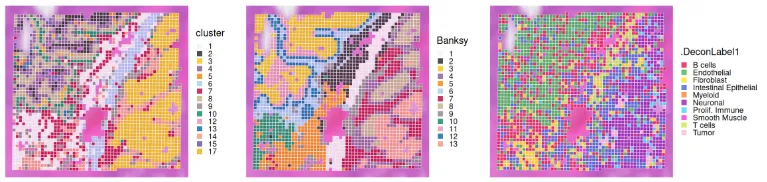
我们观察到 Banksy 非常清晰地描绘出组织边界,而 deconvolution 则直接提供了对底层聚类的生物学洞察。它们的一致性可以通过热图进行可视化:
fq <- prop.table(table(.vhd16$Banksy, .vhd16$.DeconLabel1), 1)
pheatmap(fq, cellwidth=10, cellheight=10, treeheight_row=5, treeheight_col=5)
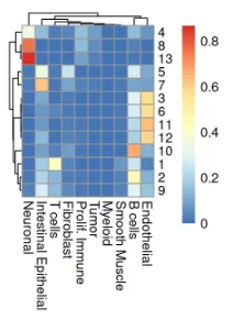
从上述热图来看,cluster 5 和 7 大多是免疫细胞;cluster 9 对应内皮细胞;cluster 1 和 13 分别对应肠上皮细胞和平滑肌细胞;成纤维细胞对应 cluster 10;肿瘤跨越 clusters 3、11 和 12。
Neighborhood 分析
在此,我们希望量化 8 µm 放大区域中 T 细胞、B 细胞或 Myeloid 分仓与 Fibroblast 或 Tumor 分仓之间的丰度。我们使用来自 Statial(Ameen 等,2024)的 getAbundances() 函数,为每个分仓计算半径 200 px 范围内其他细胞类型的丰度;得到的(分仓 × 类型)矩阵被存储在 reducedDim 槽 "abundances" 中。
.vhd8 <- .vhd8[, !is.na(.vhd8$.DeconLabel1)]
xy <- data.frame(spatialCoords(.vhd8))
colData(.vhd8)[names(xy)] <- xy
.vhd8 <- getAbundances(.vhd8,
    spatialCoords=names(xy),
    cellType=".DeconLabel1",
    imageID="sample_id",
    r=200, nCores=4)
让我们看一下丰度和距离结果,还包括反卷积结果:
df <- reducedDim(.vhd8, "abundances")
df$CT <- .vhd8$.DeconLabel1
df[1:5, 1:5]
接下来,我们只挑出 T 细胞、B 细胞和髓系细胞所在的格子,看看在它们周围,成纤维细胞或肿瘤细胞的“数量”是否存在空间上的亲疏差异。
source <- df$CT %in% c("T cells", "B cells", "Myeloid")
target <- c("Tumor", "Fibroblast", "CT")
fd <- pivot_longer(
    df[source, target], cols=-CT,
    names_to="target", values_to="n")
head(fd)
在该区域,我们观察到每个免疫分仓周围出现的 fibroblast 分仓数量多于 tumor 分仓。然而,请注意,在此放大区域内,fibroblast 分仓的总数本身就比 tumor 分仓多出约 1.4 倍。因此,必须将丰度值按该区域中目标细胞类型分仓的总数进行归一化。
n_tum <- table(.vhd8$.DeconLabel1)["Tumor"]
n_fib <- table(.vhd8$.DeconLabel1)["Fibroblast"]
fd$p <- ifelse(fd$target == "Tumor", fd$n/n_tum, fd$n/n_fib)
ggplot(fd, aes(x=CT, y=n, fill=target)) +
    labs(y="# cells within 200px") +
ggplot(fd, aes(x=CT, y=p, fill=target)) +
    labs(y="relative abundance") +
plot_layout(nrow=1, guides="collect") &
    geom_boxplot(key_glyph="point") &
    scale_fill_manual(values=c("yellow", "pink")) &
    guides(fill=guide_legend(override.aes=list(shape=21, size=2))) &
    theme_classic() & theme(
        axis.title.x=element_blank(),
        legend.key.size=unit(0, "lines"))
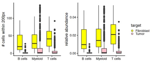
校正后,我们观察到在该放大区域内,每种免疫细胞类型周围的 fibroblast 分仓相对于 tumor 分仓的相对丰度差异被进一步放大。
我们还可以基于给定半径内两种细胞类型之间的最小距离来研究“cell-cell-marker”关系。所有细胞类型两两之间的最小距离矩阵被存储在降维结果中,与之前存储丰度矩阵的方式类似。
# NOTE: conversion to SCE is a temporary fix for a 'Statial' bug
# reported here: https://github.com/SydneyBioX/Statial/issues/16
tmp <- as(.vhd8, "SingleCellExperiment")
tmp <- getDistances(tmp,
    cellType=".DeconLabel1", imageID="sample_id",
    spatialCoords=names(xy), maxDist=200, nCores=4)
reducedDim(.vhd8, "distances") <- reducedDim(tmp, "distances")
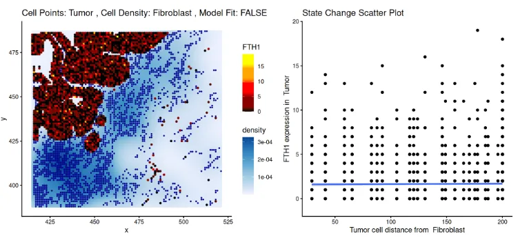
在此,我们旨在确定肿瘤标记物的表达水平是否随着与 fibroblast 的距离变化而改变。以 FTH1 为例,我们观察到肿瘤分仓中 FTH1 的表达随着与 fibroblast 距离的增加而下降。这一趋势可用散点图进行可视化。
p <- plotStateChanges(
    cells=.vhd8,
    image="sample01",
    from="Tumor",
    to="Fibroblast",
    marker="FTH1",
    cellType=".DeconLabel1",
    imageID="sample_id",
    spatialCoords=c("array_col", "array_row"))
p$image + facet_null() | p$scatter
整套分析流程同样适用于 16 µm 分辨率、未经过滤的 Visium HD 数据及其配套去卷积结果。
总结
在本工作流程中,我们展示了如何对 16 µm 分仓的 Visium HD 数据子集执行标准分析管道。